Friday, May 30, 2008
Oops, I did it again...
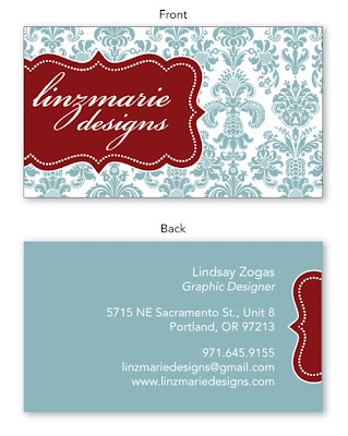
I was totally just listening to Britney so I apologize to the headline :) But... I really did do it again. Remember a couple months (or weeks?!?!) ago, I said I have ADD when it comes to my logo? How I always want to update and change it? Well... I kinda sorta want to do it again. But not a drastic change, just something a little more interesting. The other day, my co-worker Holly and I were talking about cool colors, and I mentioned that I've always loved blue/greens, similar to the Pool used in Beth & Ken's invitations. I said, "I should've used that in my logo..." Well, it got me thinking. Why don't I try it? So I switched out the black damask for a softer pool-color, and I was pleased, but not totally satisfied. I decided to push the logo off to the side and let it "wrap" around to the other size of the business card. The open space on the front side (to the right of the logo) makes me uncomfortable, and for that reason I like it! So now I have to ask all you readers out there-- which do you prefer? The old or the new? I appreciate your feedback, so be honest!


Labels:
Linzmarie Designs
Subscribe to:
Post Comments (Atom)

L,
ReplyDeleteThat looks slick! I like the color and the arrangement. You have such a good eye!
Kathleen
This card looks fantastic, but where is the old card as a basis for comparison? Or are we just comparing it to the design at the top of the page?
ReplyDeleteI'll upload my current business card later when I have more time, good idea. But for now, just compare it to the top graphic with the black pattern and centered logo.
ReplyDeleteOk well I like the new one better. More depth, ingenuity, pizzazz, etc. And I REALLY like the edge extending over to the back. Very, very well done.
ReplyDeletePlease send me some so I can hand them out. They're awesome!
ReplyDelete